The Poughkeepsie Ice House is a waterfront restaurant next to Walkway Over the Hudson, focusing on farm-fresh, local, and sustainable food and drinks. The branding was designed to feel punchy and vibrant, with a nod to the relevance of the name — the restaurant is in a building that was actually used as an Ice Pickup/dropoff many years ago. The “ICE HOUSE” portion of the logo is meant to evoke a block of ice.
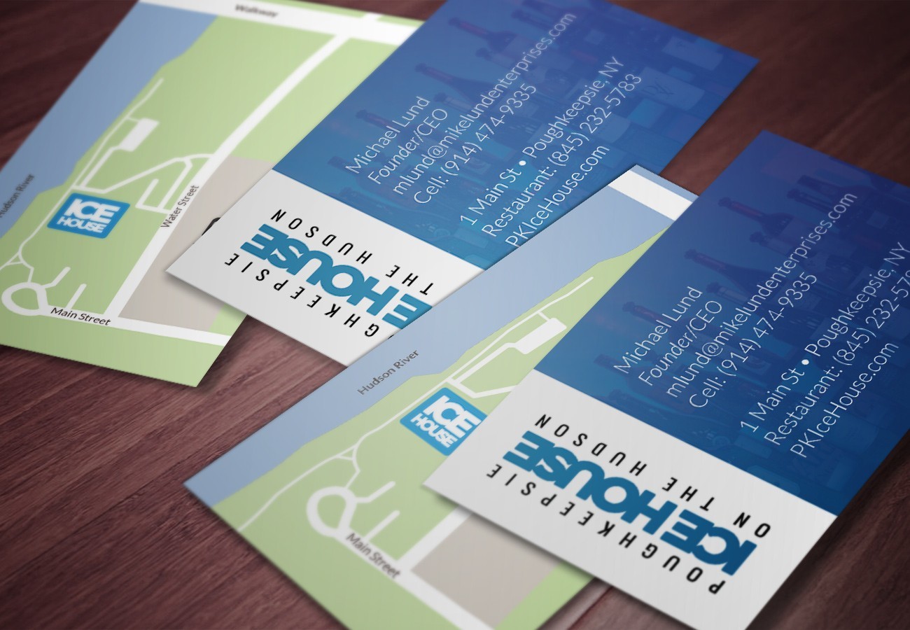
Their business cards were designed to push the branding style forward. A custom map was designed to show the restaurant’s location in relation to nearby landmarks (the Walkway and the train station).
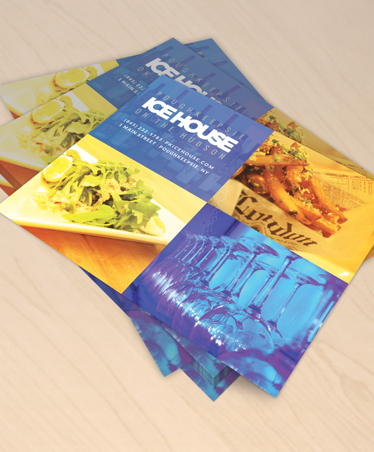
Some of the print material uses hot colors to offset the usual indigo/light blue that is present in most of the branding.
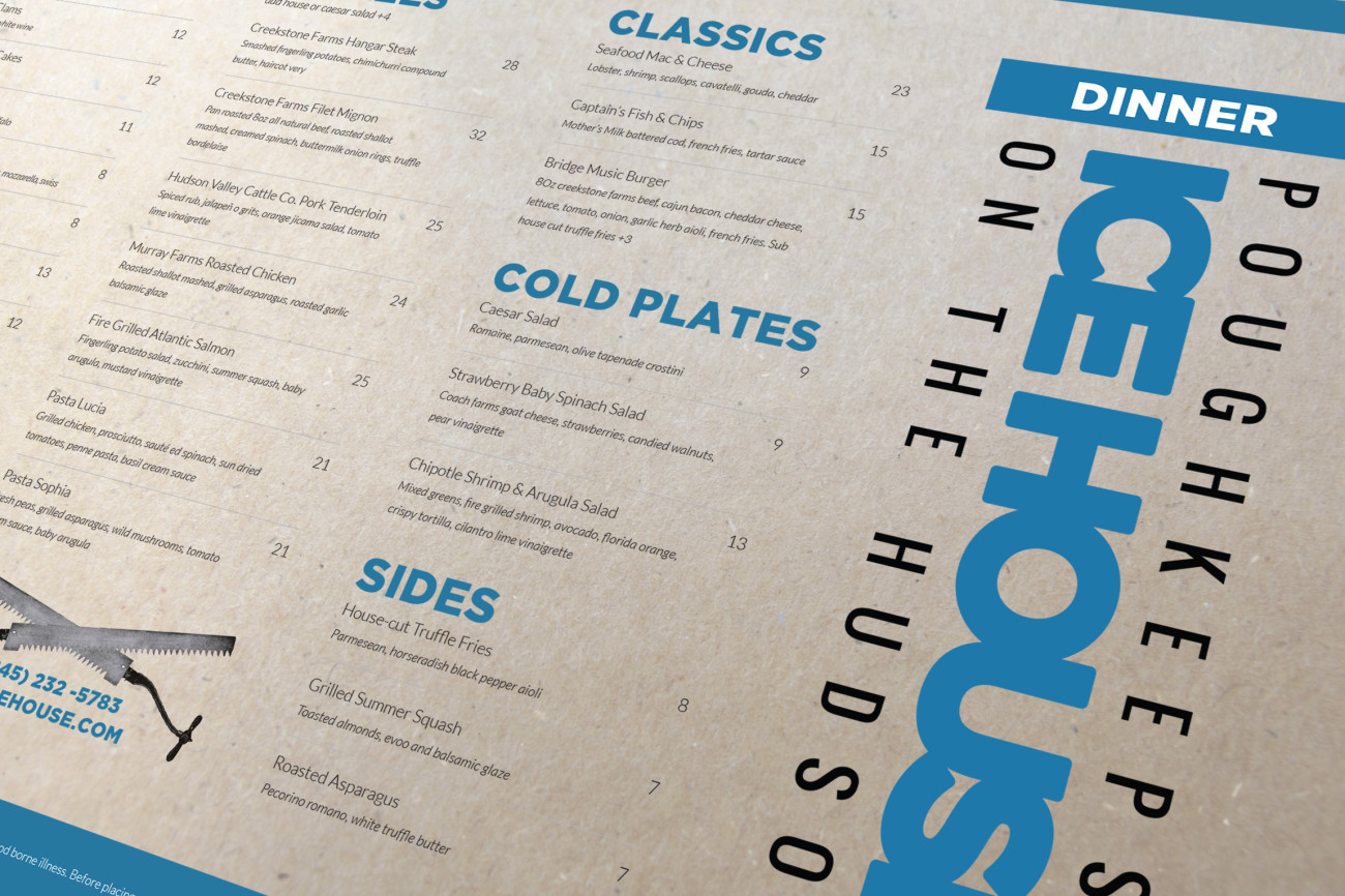
The menus were designed to be easily readable and easy to skim with punchy category titles. They were printed on cardboard-textured cardstock.
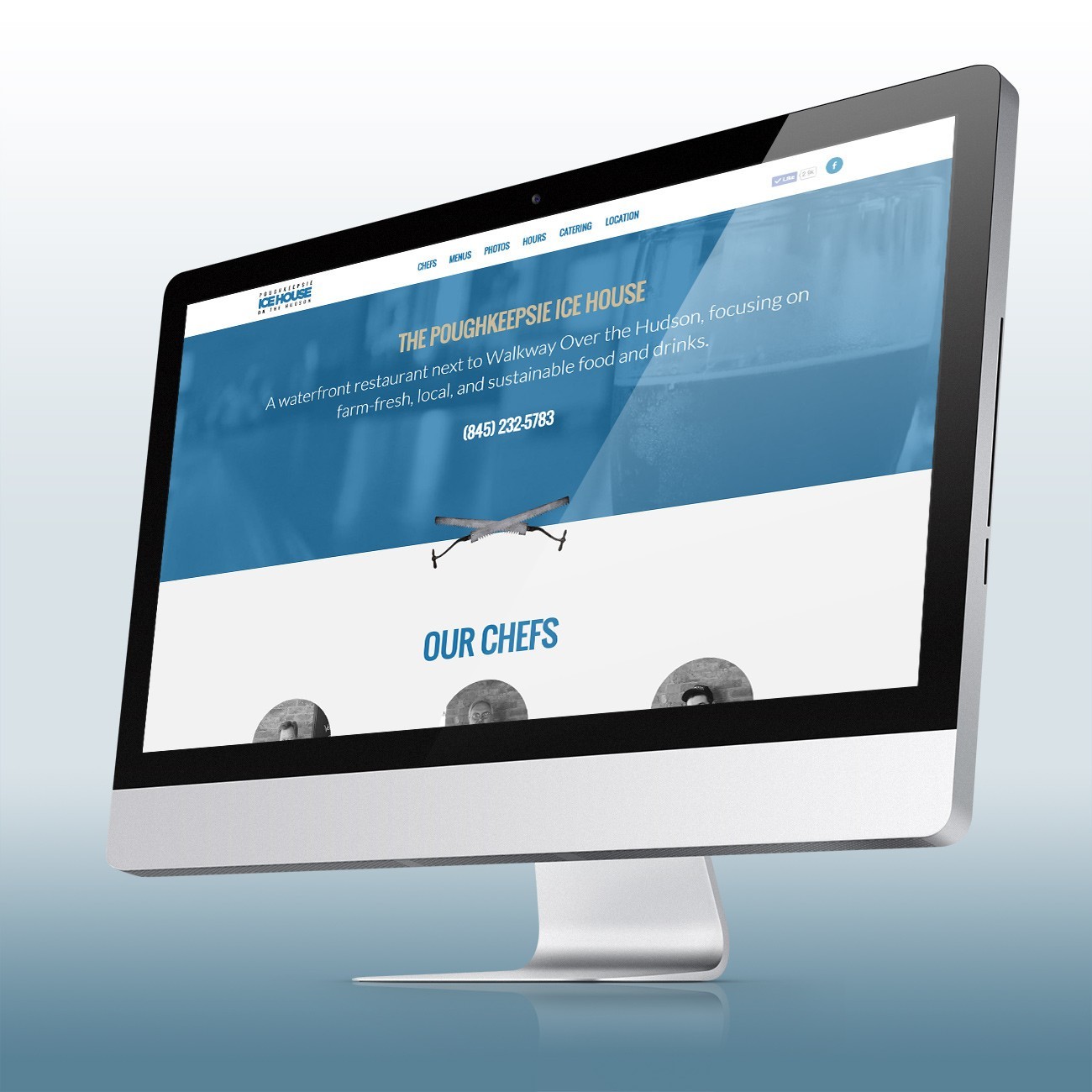
The website was designed to provide users with a place to get every piece of info they’d want about a restaurant/venue: location, events, menus, and other information.
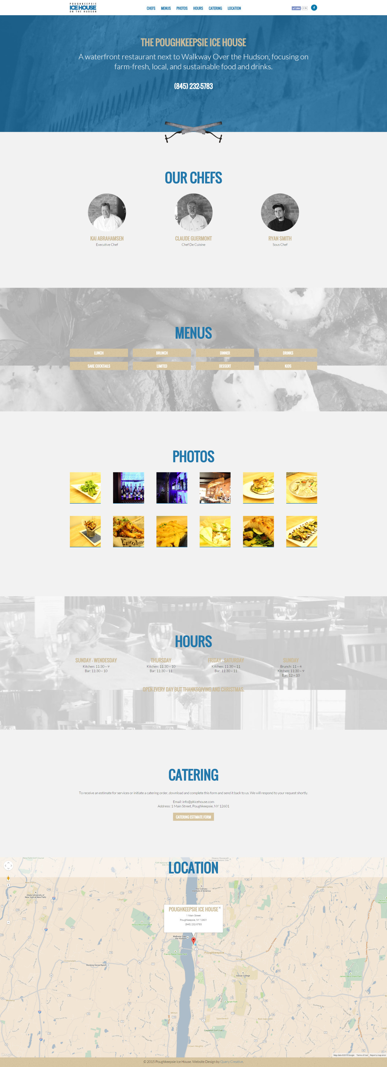
The website is designed as a long single page scroll, so users can either click to go to different sections or simply scroll down.
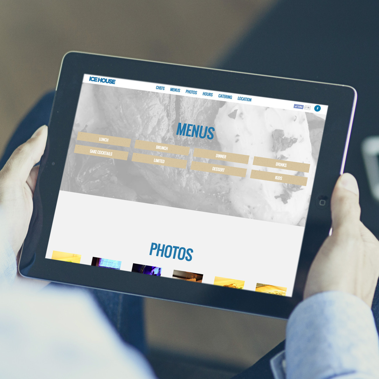
The website was designed to be responsive; to accommodate tablets, smartphones and any other mobile devices. It was built in WordPress, making it easily editable. Content can be added/removed/changed with a few clicks.
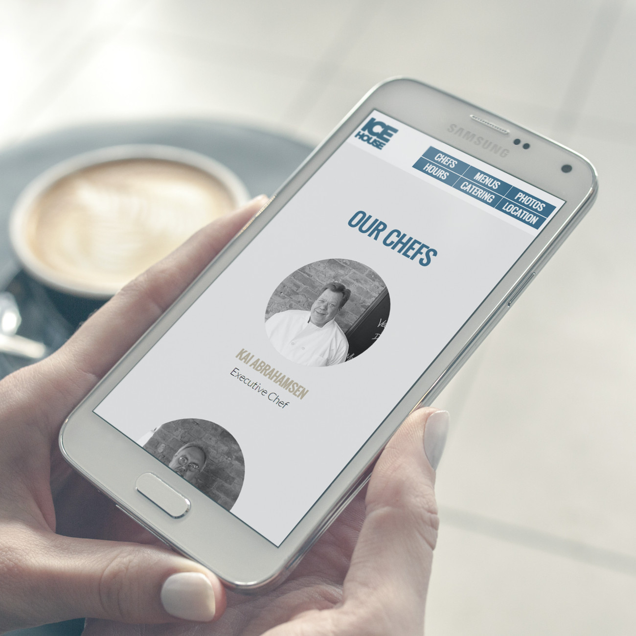
The mobile version of the website allows exactly the same functionality and information as the desktop version, but with an accommodating layout and structure. The branding is preserved as well, so the website “feels” the same and doesn’t look like a generic mobile template website.

I am pleased to call Cody a friend and someone I call on for advice. He is sharp all around -- just leave him alone and let him work. He's one of those people you should not try to micromanage or question too heavily. Let him be, and he'll give you beautiful work.
— Michael Lund, Poughkeepsie Ice HouseRead all testimonials ›